Why A Mobile Responsive Website
Before Mobile Responsive Websites...
Around 15 years ago, if a website looked good on a desktop monitor a web designers job was complete. In today’s world however, this is no longer the case. With smart phones and tablets becoming popular in all age groups and more often than not, being used for web surfing and internet shopping.
It has become a mission critical status for any quality web designer to ensure their work not only looks great on smaller screens but is just as usable as its bigger counterpart the desktop screen. When it comes to your website, screen size matters when talking about conversion ratios and SEO score with search engines.
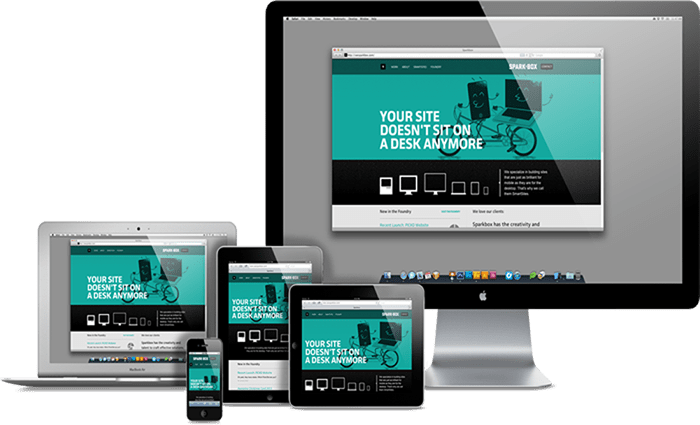
Some common indicators of a highly responsive design will be the websites ability to utilize side to side aspects of the webpage on all screen sizes from desktop to phone, the ability to automatically detect and adjust itself and menu systems to be compact on smaller screens is also a key feature on many designs these days.
For obvious reasons you want every website visitor to have the best possible experience when viewing your website. Your site conversion ratios and bounce rate will be greatly affected should this not be the case. If a web visitor finds your site hard to navigate, their opinion of you, your services or products also will come under negative light.
Aside from this, search engines now scan, and grade websites based on how well they will respond to smaller screen sizes. If they detect your site to be poorly represented on smaller screens this will have great negative implications when it comes to their decision on which websites will be listed higher up on pages and which sites shouldn’t.
If you are running on a website that is 10+ years old, there is a good chance your website is not properly optimized for mobile device traffic and as a result you may be sliding in SEO score. Although upgrading your website from older, outdated platforms onto a newer and fresh design may have some expense tied to it. The cost is more than paid for when your page ranking and visitor to client conversions go up resulting in profits.
At Website Wizards we offer website designs that are 100% mobile responsive and artistically stunning regardless of the screen size. For a demo of our designs, please see out website demos area of the website or contact us for a more customized demonstration.
Helpful Advice
During your website design process, constantly check your page from different devices to ensure it looks good from all devices.
Google has taken a “mobile first” approach to websites meaning they judge you more by how you look and function on mobile then desktop devices.
Ensure an easy to read font size and type for mobile devices.